

Artwork Guidelines: How to Prepare Print Ready Files for Your Packaging
Getting your packaging artwork ready before printing can save you time, money and unnecessary changes. At ZEE Packaging, we often see customers facing small artwork issues that can delay their orders. Most of these problems can be avoided with few simple checks. So here is a guide to help you prepare your print ready files correctly.
Why File Setup Matters So Much
Packaging printing is different from regular home printing. Your artwork goes through color separation, plate making and other production steps. Even a small 2mm mistake can affect thousands of printed boxes. That is why checking your artwork before production is very important.
Start With the Dieline
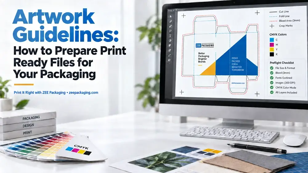
Before you start designing, make sure you have the correct dieline. A dieline is a flat template of your box that shows where it will be cut, folded and glued.
- Cut lines show where the box will be cut
- Fold lines show where the box will be folded
- Glue flaps are areas used for joining the box
- Safe zone is where important text and logos should stay
Always place your artwork on the dieline and keep the dieline on a separate layer. Name the layers clearly and set the dieline to overprint where required.
File Formats We Accept
At ZEE Packaging, you can send your custom packaging artwork in different file formats.
- AI (Adobe Illustrator): Our preferred format
- PDF: Preferably PDF/X-1a or PDF/X-4
- EPS: Suitable for vector artwork
- PSD: For designs with more images
Vector files are better for logos, text and line work because they stay sharp when resized. Raster images can also be used, but make sure they have enough resolution.
Color: CMYK, Pantone and Why It Matters
For your packaging artwork, you can choose CMYK or Pantone colors depending on your design and brand requirements.
CMYK is commonly used for full color printing, while Pantone colors can be selected when you need more consistent brand colors. RGB colors are used on screens and may look different when printed.
Here are few important things to consider:
- Total ink coverage should generally stay under 300%
- Rich black for large areas can use 60C 40M 40Y 100K
- Small black text should normally use 100K only
- Trapping helps prevent gaps caused by small printing misalignments
Resolution and Image Quality
Your packaging images should be 300 DPI at their final printed size. If you enlarge a small image too much, it may look blurry or pixelated after printing.
Always check the final image resolution before sending your artwork.
Bleed, Trim and Safe Margins
Your artwork should have proper bleed and safety margins to avoid printing and cutting issues.
- Bleed: Extend your design 1/8 inch beyond the cut line
- Trim: The actual line where your box will be cut
- Safety margin: Keep important text and logos 1/8 inch inside the trim
These small margins help prevent unwanted white edges or missing parts of your design after cutting.
Fonts
Before sending your artwork, make sure all fonts are outlined or embedded in the PDF. Otherwise, missing fonts can change the appearance of your design.
You should also keep an editable copy of your original file, because outlined fonts cannot be edited as normal text.
Finishing Layers
At ZEE Packaging, you can choose from different finishing options to customize your boxes. If your design include special finishes, they should be marked on separate artwork layers.
Available options include:
- Spot UV: For highlighting selected areas
- Foil Stamping: For metallic details
- Embossing: For raised designs
- Window Patching: For adding a transparent window
Name each finishing layer clearly and use a separate spot color where required. Keep small foil and emboss details simple, as very fine designs may not print properly.
Barcodes and Compliance Content
If your packaging needs a barcode, it should preferably be in vector format with solid black printing on a white background. Keep the quiet zones clear and avoid placing it across folds or curved panels.
For food, cosmetics and other regulated products, make sure your labels, warnings and required information meet the rules for your product category.
What Happens After You Send Files
Once you send your artwork to ZEE Packaging, our team checks the dieline, colors, resolution, bleed, fonts and finishing details.
If anything needs correction, we will inform you before printing. You will receive a digital proof to review your packaging design, including the flat artwork and 3D mockup where applicable.
Production only starts after you approve the final proof.
People Asked Questions
What is the difference between spot color and process color?
Process colors use four inks (CMYK) to create different shades. Spot colors use a premixed ink for a specific color. You can choose CMYK for full color designs or Pantone for more consistent brand colors.
Why does my printed box look different from my monitor?
Screens use RGB light, while printing uses ink on paper. The material also affect how colors appear. For example, colors on coated SBS may look brighter than on uncoated kraft paper.
What does overprint mean and when do I use it?
Overprint allows one ink to print over another instead of leaving the area underneath blank. It is commonly used for certain black text and special printing elements. Incorrect settings can affect your final artwork.
Do I need to include bleed if my design has a white background?
If your design is completely white around the edges, extra bleed may not be necessary. However, if any color, image or design reaches the cutting edge, you should include proper bleed to avoid unwanted white lines.
What is a proof and what should I check on it?
A proof shows how your packaging design will look before printing. You should check spelling, box dimensions, colors, barcode placement, panel positions and finishing details. Once you approve it, your boxes will be produced according to the approved artwork.